

One of the ideas for the TPX blog is to show the process behind our work, like we did in this early post about the development of Design My DSM. Design My DSM went live on the web in April, and, if you haven’t seen it yet, you can still check it out today at designmydsm.thetomorrowplan.com.
Four months later, we have a treasure trove of interesting data to consider. One of our ongoing tasks is weaving that information into the plan; in the short term, our team needed to look at the data, tease out some findings, and find a way to tell that story.
One of the joys of building a tool like Design My DSM is this very moment, where suddenly, a large data set arrives, ripe for analysis and visualization explorations. I got to spend some time thinking about how to best explain and contextualize this data for The Tomorrow Plan. This post shows a series of those components (and please don’t be shy about leaving feedback in the comments).
First of all, some numbers: there are 17 communities in The Tomorrow Plan study, with approximately 480,000 residents. For Design My DSM, we saw participation from 100% of those communities, with about 955 unique responses from zip codes within the study region. But in our first data download, there were many, many more entries, and the first step was to filter out all non-Des Moines area zip codes – this was fascinating because we saw participants from far-flung places all over the United States, including California, Colorado, Georgia, Illinois, Kansas, Louisiana, Massachusetts, Michigan, Minnesota, Missouri, Nebraska, New Hampshire, New York, North Carolina, Ohio, Oregon, Tennessee Virginia, Washington, Washington D.C., and communities from all over Iowa. This was a nice reminder that even though this project is focused the very local planning question of what sustainable development should look like for Greater Des Moines, the interest and attention towards this project is national in scope.
But back to that local question of what those responses mean for the plan. For the purposes of our analysis, we only looked data from communities inside the study region. One thing the graphs showed right away is that game participants skewed younger than the population in the zip codes in the study area, which didn’t surprise us too much, given the web-based nature of the application.
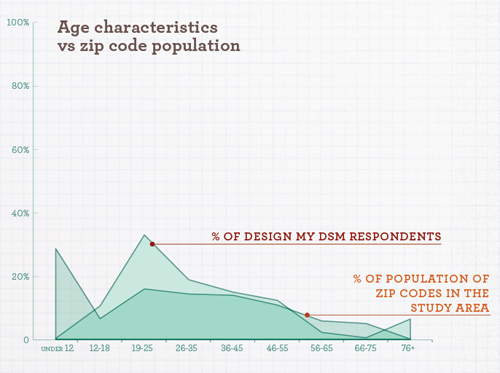
I was disappointed that we had so few participants from the K-12 school-age crowd; I was hopeful that the game would reach a young audience. Isn’t every kid itching to learn a little about urban planning? Maybe we’ll go viral on Facebook next month.
Next, we ranked the total number of stars received per priority for the whole region.
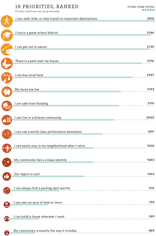
Overall, the game respondents from around the region told us their top three priorities were:
1. I can walk, bike, or take transit to important transportations
2. I live in a great school district
3. I can get out in nature
And squeaking in at fourth place:
4. There is a park near my house
These results jive with what we’ve heard throughout the process: transit, schools, nature, and parks are all very important assets for quality of life in the region.
We wondered what it would look like to compare each city’s top three priorities to one another. Would there be common patterns between the different cities? For this one, I tried an approach analogous to putting marbles in a jar, and then comparing how tall the stack is.
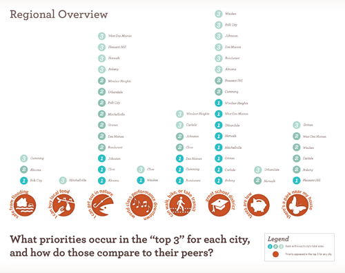
The city patterns are more nuanced in this view, but again, nature, transit, schools, and parks are top choices.
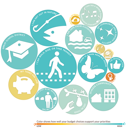
The data analysis and visualization process is still underway with more of the data, but we couldn’t resist trying one last test. If we fed the regional priority results back into the Design My DSM game, what would the resulting Design Profile look like? Then, if we allocated coins according to the aggregate “budget” culled from the data on the coins screen, would the colors suggest that the region did a good job of funding the priorities they collectively care about? Here’s the resulting image (priority names added in Illustrator). In sum, the result looks good – it’s a promising end product for this experiment.
Stay tuned for the final Design My DSM report, which will be posted in the next few weeks.
Also, we’ll be weaving the results into the material we’re preparing for The Tomorrow Plan’s first future fair – Choose Tomorrow – which comes to the World Food Prize Hall of Laureates on Thursday, August 2nd from 4:30 to 7:00 pm. The event will feature a 5:30 pm presentation by Shelley Poticha, the Director of HUD’s Office of Sustainable Housing and Communities.
 Sarah Madden is an urban planner and graphic designer on The Tomorrow Team, and the Planning Sustainability Coordinator at Sasaki. She loves a good creative challenge that blends planning ideas, visual design, and dynamic media.
The “budget” piece is a bit hard to decipher without seeing the data that went into it; the size of the circles is perhaps the puzzling part. I presume that circle size represents “actual volume” spent. Since I forget now exactly how we “spent” our coins, I can’t intuitively grasp how the “Low Taxes” circle rates nearly the same color (medium low) as “Large Lots” but a much larger size. Did we “spend” on low taxes somehow?
And of course the “circle size-representing volume” approach points out some interesting realities: our desires for our community can’t always be expressed by the volume of funding. This is demonstrated by the “Stay the same” circle – how do we fund that?
It also points out that some things are logistically hard to fund, even if it’s a high priority, and some things shouldn’t be attempted with funding: a diverse community is an extremely important community goal to me (economic and social stratification hurts the culture as a whole), yet it would seem misguided to try to achieve it with money.
All interesting stuff! I’m grateful for all the effort that has been put into this project – an example of funding that really has gone to a useful purpose. The Tomorrow Plan points out the importance of awareness raising, and using conscious choices that were deliberated at length as we make changes to our world.
Thank you!
Pingback: Realizing Our Potential | The Tomorrow Plan